REI DASBARRAS
Visual system and brand applications for a company working in accessibility solutions.
Accessibility gains presence in every detail.
Identity applications · Packaging · Catalogue · Signage · Uniforms
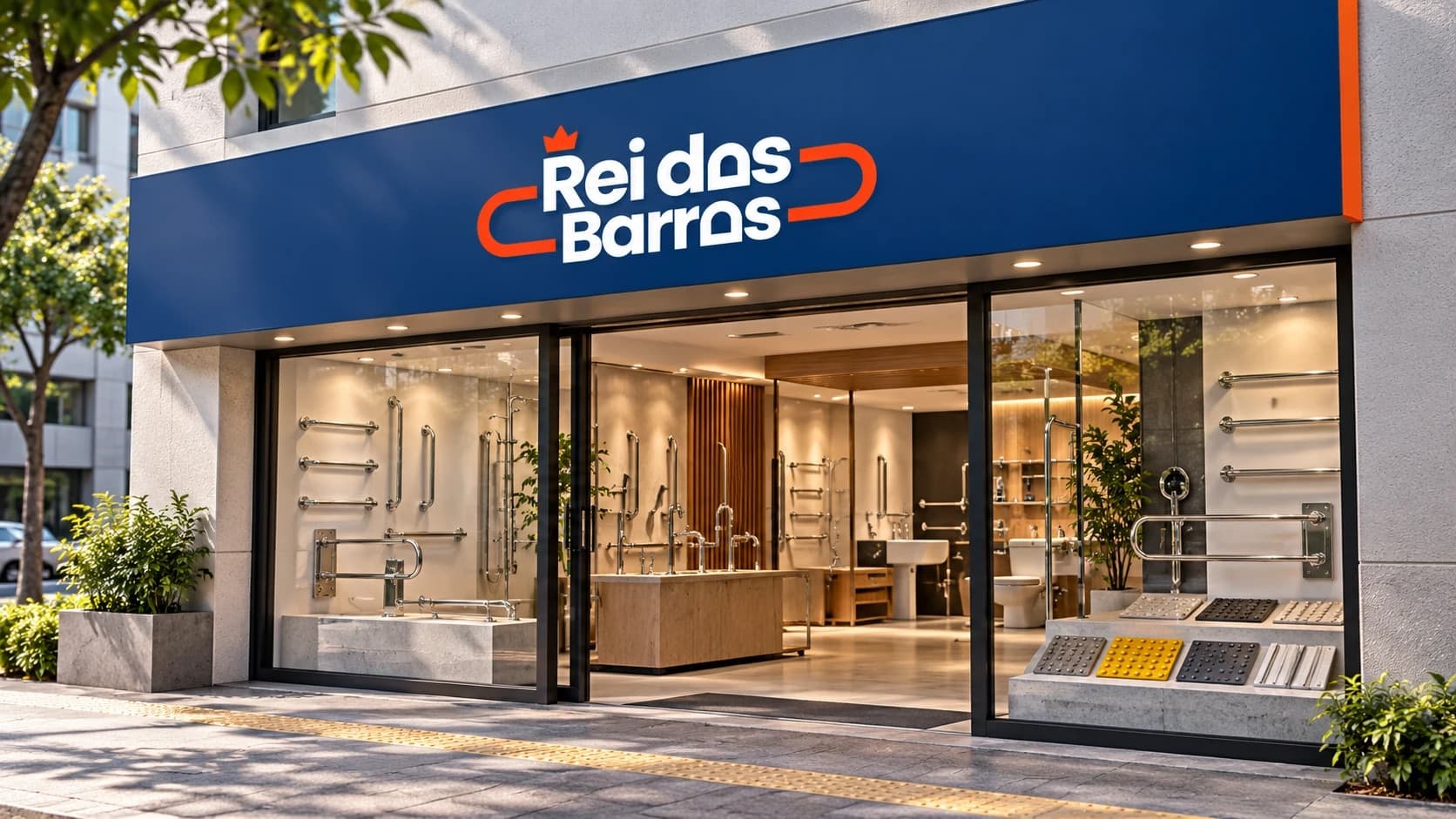
Art direction and application of the identity to packaging, catalogue, uniforms, fleet, signage and storefront, creating a consistent system across the brand's touchpoints.
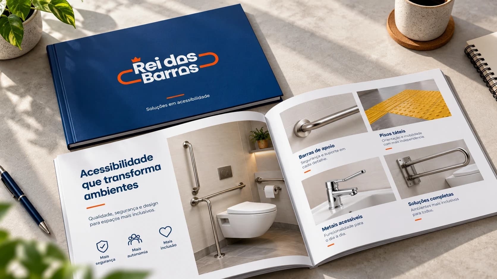
The project translates Rei das Barras' work into a recognisable and functional visual presence. Deep blue carries the sense of safety, while orange creates contrast and highlights the signature across materials, always with clear reading and a close tie to the world of construction and accessibility.
The applications cover the full path of the product and the company: packaging, sales catalogue, point-of-sale communication, uniforms, vehicle and storefront. Every piece follows the same system of colour, typography and composition, which keeps the brand consistent both when presenting to a client and in the daily work of installation and service.
The seven applications delivered, from the product packaging to the storefront.
